|
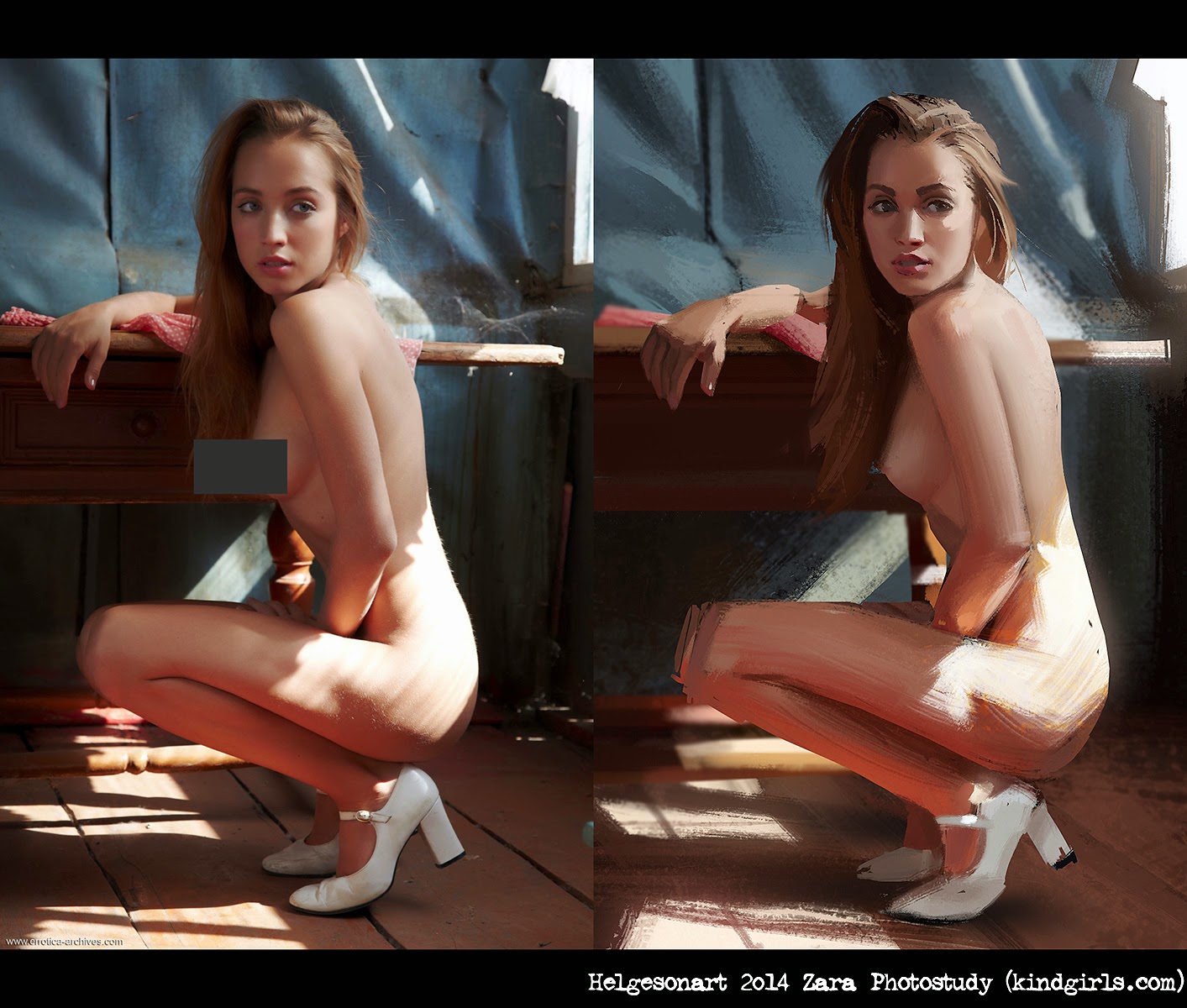
| Studying the magnificent Sargent. Original on left, my study on the right. |
A study of Sargent, how I do it. For future reference, and because stuff like this helped me out when I started practicing painting seriously back in 2006. The conceptart.org community was the best, back in the day, and people such as
Tom Scholes and
Patri Balanovsky helped me out a lot in those early days. I feel a kind of obligation towards the art-community to share, as a sort of pay-back, and furthermore, by writing this I have to face my ignorance and mis-conceptions. It's an ego-destroying-process, once again reminding me of how little I know, how much I have to learn, and motivating me to practice more and better. Also this is challenge, and I love those...
1. Shape Block-In
 |
| Step 1, getting the shapes right with a 100% Opaque Brush. |
At first, looking at a master-painting I panic. There's so much great stuff going on at the same time, the direction of the strokes, the edge-control, the bouncing light and materials etc. Where to start?! For me, it makes sense to try to decipher the major shapes...
A shape is a flat area of value or color, not to be confused with a form. Square, circle, rectangle, triangle, those are shapes, whereas a cube, sphere, pyramid and cylinder are forms. I try to reduce the complexity of the shapes, reducing the amount of bumps initially, and then increasing in complexity gradually. Inside the shapes, I draw in some very simple lines (usually pretty straight), indicating major landmarks, making it easier for me to judge the relationships of the shapes. Things like the bottom of the chin, cuts in the clothes etc is what I'm looking for. Easily identifiable landmarks showing where shapes will start and end. I'm eye-gauging some things, but I am also drawing horizontal lines from the original (this requires having the two images side by side), to aid me in the placement. I'm
CHEATING 'cause I'm a horrible person. If the intent of the study was to practice drawing, I would deprive myself of that method, but this is mainly about painting.
What I'm NOT DOING is constructing forms, which is a method outlined by artists such as Glenn Vilppu. That stuff is very useful, and it's what I studied to learn how to draw, but this is a more academic approach. Construction of the forms is great for animation, but it's unnecessarily time-consuming and more appropriate for pure-drawing practice. In addition, I'm NOT trying to make a pretty linedrawing. I think it's important to know what it is you're trying to practice, and focus on that. Know what you're doing, and commit to that fully. "When I am walking I am walking; when I am eating I am eating.".
I'm using a strictly 100% Opaque brush, so I don't have to think about edge-hardness and smooth transitions etc, that comes later. I'm using the brush and eraser in equal amounts, adding and cutting out of the shapes to get the result I want. In addition, you don't have to think only about the positive shape, the negative shape gives very helpful clues in placing everything in the right place. Things such as the edges of the canvas are powerful allies in getting the right placement of shit! If there's a lot of sfumato and lost edges going on you'll simply have to imagine where the shapes start and stop.
This step is
VERY IMPORTANT, it lays the foundation for everything else, and requires
PATIENCE and being meticulous and careful. This step can take
HOURS. It doesn't look very sexy, but you'll just have to accept that and postpone your gratification.
Command of shapes and shape-design is one of the most powerful tools we have as concept-artists. If you don't know about things like Straight vs. Curve, Tapering, Size-Variation, Primary/Secondary/Tertiary- shapes, the psychology of squarish, circular, triangular and asymmetrical shapes, you might want to dedicate some study-time towards that :) I know I certainly have A LOT to learn.
For a bit more on shape and painting, check out
Shaddy Safadi's video-tutorials. In my opinion one of the most generous contributions aimed at the betterment of the concept-art community in recent years.
2. Squinting Level Rendering
 |
| If
I squint my eyes, like Clint Eastwood, the study looks pretty similar
to the source (except the head, I'm leaving that for later). |
Put down colors in big strokes, focusing on the whole image at the same time. I try to get everything to a 10% of maximum render level. When I quint my eyes, which I do a lot, I want my study to look almost identical to the original. I resist the urge to jump in and render, especially the focal areas. I'm a sucker for pretty faces, so I'm really conscious about maintaining discipline here. At this point you really need to know which your focal-points are going to be. One of my major flaws has been rendering everything at the same level, and that's time-consuming, in-efficient, and looks boring. I suppose some people prefer that look, but I'm not one of them. I usually work on the big areas such as the background first, gradually working on smaller fields of color.
As I'm painting, I've locked the layer transparency, so I won't go outside of the shapes I established in the previous step. Sometimes I'll create a new layer which I lock into the underlying layer as well. If I notice that my silhouette is really off, I'll unlock the transparency and fix the shape.
If you consider each stroke as a shape, it gets easier I think. Again, like in the last step, we're just placing big shapes in the proper relationship to each other. I try to avoid working with small sized-brushes in this step. To get the right color I am doing a lot of colorpicking. This is probably a big NO-NO, but I'm selectively lazy. And I'm getting results and learning stuff, so fuck it. I feel I understand why the color looks the way it does. I think it's good to have a fairly good idea of color-theory if you want to use the color-picker. I would suggest the following for a solid foundation on the subject:
http://itchy-animation.co.uk/tutorials.html
http://androidarts.com/art_tut.htm
http://www.huevaluechroma.com/ (this is heavy, but the most in-depth I've read)
(Book) James Gurney's "Color & Light"
(DVD)
http://www.thegnomonworkshop.com/store/product/981/Efficient-Cinematic-Lighting
http://theartcenter.blogspot.se/2010/03/sam-nielson-painting-process.html
http://theartcenter.blogspot.se/2010/03/sam-nielson-painting-process-part-2.html
Jaime Jones outlined in one of his step-by-step paintings, that he switches brushes to avoid a "samey" look. Well, that looks nice so I stole that. I switch brushes quite a bit, although I have a favorite bristled one which I use for a lot of the skin. I try to avoid the smooth airbrush, cause it looks very photoshop, and it kills a lot of the random textured interesting stuff. Later, when we really want to model the form and sculpt, using the airbrush along with some selections is awesome, but not at this step.
3. Final Painting
 |
| Refining the shapes and strokes, zooming in a bit and adding details.. |
Yah yah, good. Now we can go into more detail! Just relax and paint using various brushes, selections and the smudge-tool. A mistake I made earlier in my career was imposing limitations on the tools I was using. Nowadays I just let photoshop be photoshop, and I'll use whatever method or tool to get the job done. Overlays, screen-layers, liquify, dodge, special-brushes, adjustment-layers, it all goes.
When I want to work on an area with detail, I'll grab a selection from the original image and put it side by side with my painting, if I had 2 computer-screens I would bring up the reference on my second screen, but I do all my work on my 17" macbook pro (which I have in my lap together with my wacom).
 |
| Finally
time to tackle the face! My favorite part, but I find it beneficial to
leave it for later, after I've rendered the rest. It can take a long
time paint, and once the face is rendered, I tend to want to over-render
the rest, because I'm comparing it to the face. |
At this point it can be nice to show some love to the edges, so everything doesn't maintain that hard-edged opaque feel from step one. I've got the main compositional elements in separate layers, and using layer-masks I can manipulate the outer edges of the shapes without risking ruining too much.
I feel that doing these studies presents wonderful opportunities to try out new tools and brushes. Since the main purpose is to educate oneself, and most certainly these paintings won't go in the portfolio, its a non-serious and low pressure context to go wild and experiment. Since I started these studies I have reformed my brush-set completely, and that's over the course of three months.
 |
| My final result of the study. Learning a lot about edges, level of detail and finish. |
So what's the point of all this? Well, for me it's about learning how to paint, and understanding from the masters how much detail is enough and how to handle brushstrokes.
Finally, maybe the best song, and music-video ever made. With this, I'm the king of the dance-floor, no joke ;P
MODJO "Chillin'" from
addictif on
Vimeo.
And here, take this from Question and Freddie Joachim! HipHop + Jazz